Branding & Visual Identity for a Luxury-Inspired Marine Company
BREEZO MARINE
Project Overview
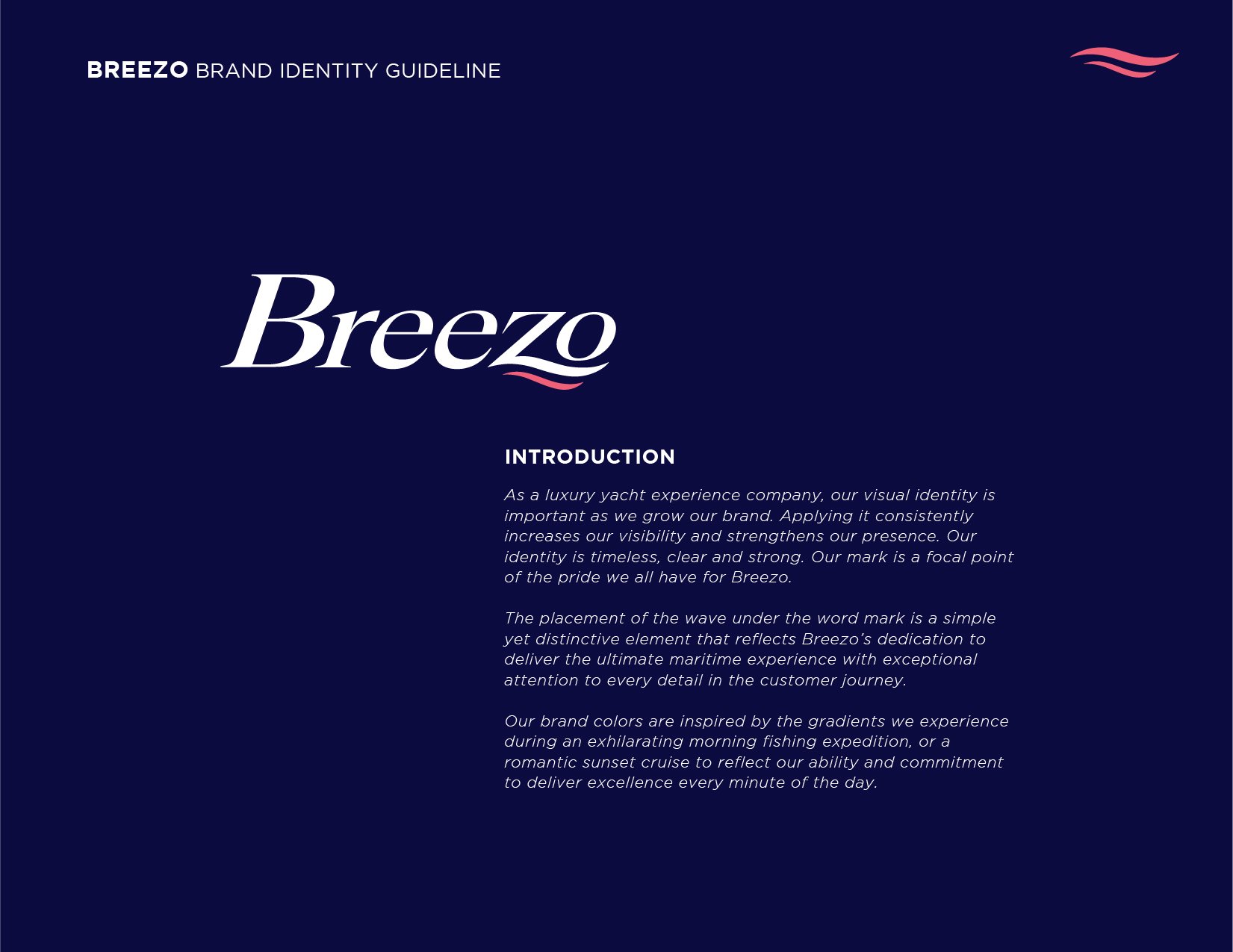
Breezo is a marine lifestyle brand built around clean lines, comfort, and a breezy luxury feel. They needed a fresh identity that could help position their new product line as modern yet approachable, with a visual tone that spoke to both marine enthusiasts and first-time buyers.
The Challenge
The brand was starting from scratch, with a name, rough concept, and a visual mood board. The goal was to create a brand identity that felt premium but not pretentious — something that looked just as good on a product label as it would on a lifestyle campaign.
My Role + Scope
Role: Lead Graphic Designer
Scope: Consultation, Logo Design, Typography System, Packaging Mockups, Brand Direction
Tools Used: Adobe Illustrator, InDesign, Photoshop, Capture One (Lifestyle photography support)
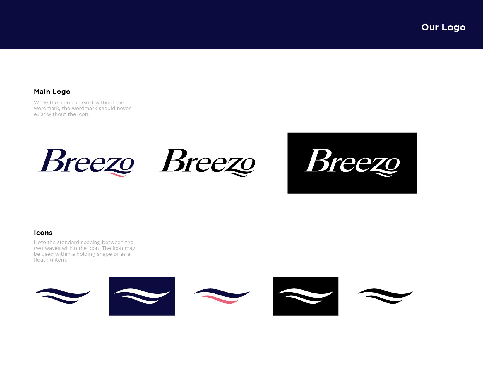
Iterated on minimalist, wave-inspired logomarks with strong negative space.
Landed on a mark that subtly echoes a breeze or ripple, paired with clean, geometric sans-serif type.
Logo Design Exploration
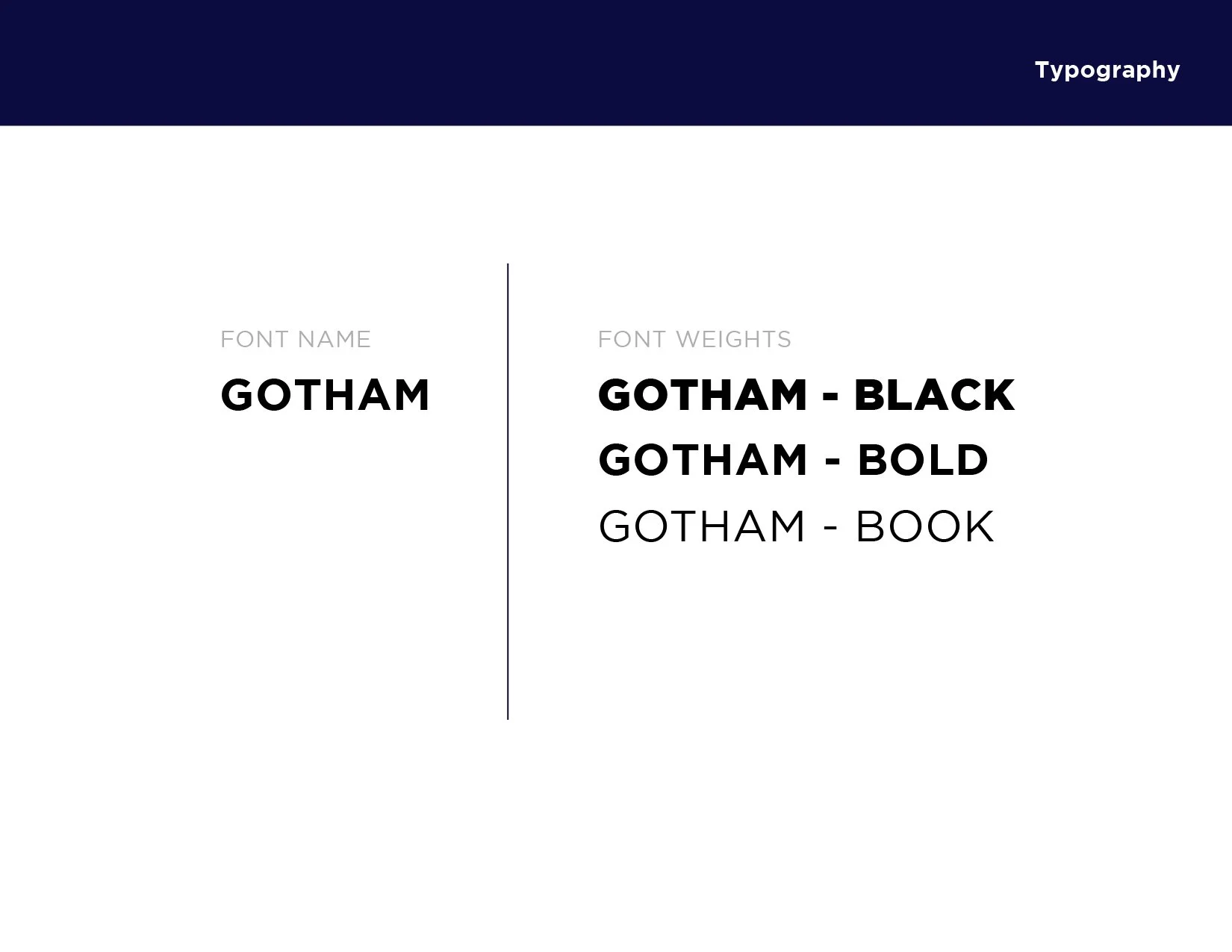
Chose a modern grotesque typeface for structure, paired with a lightweight serif accent.
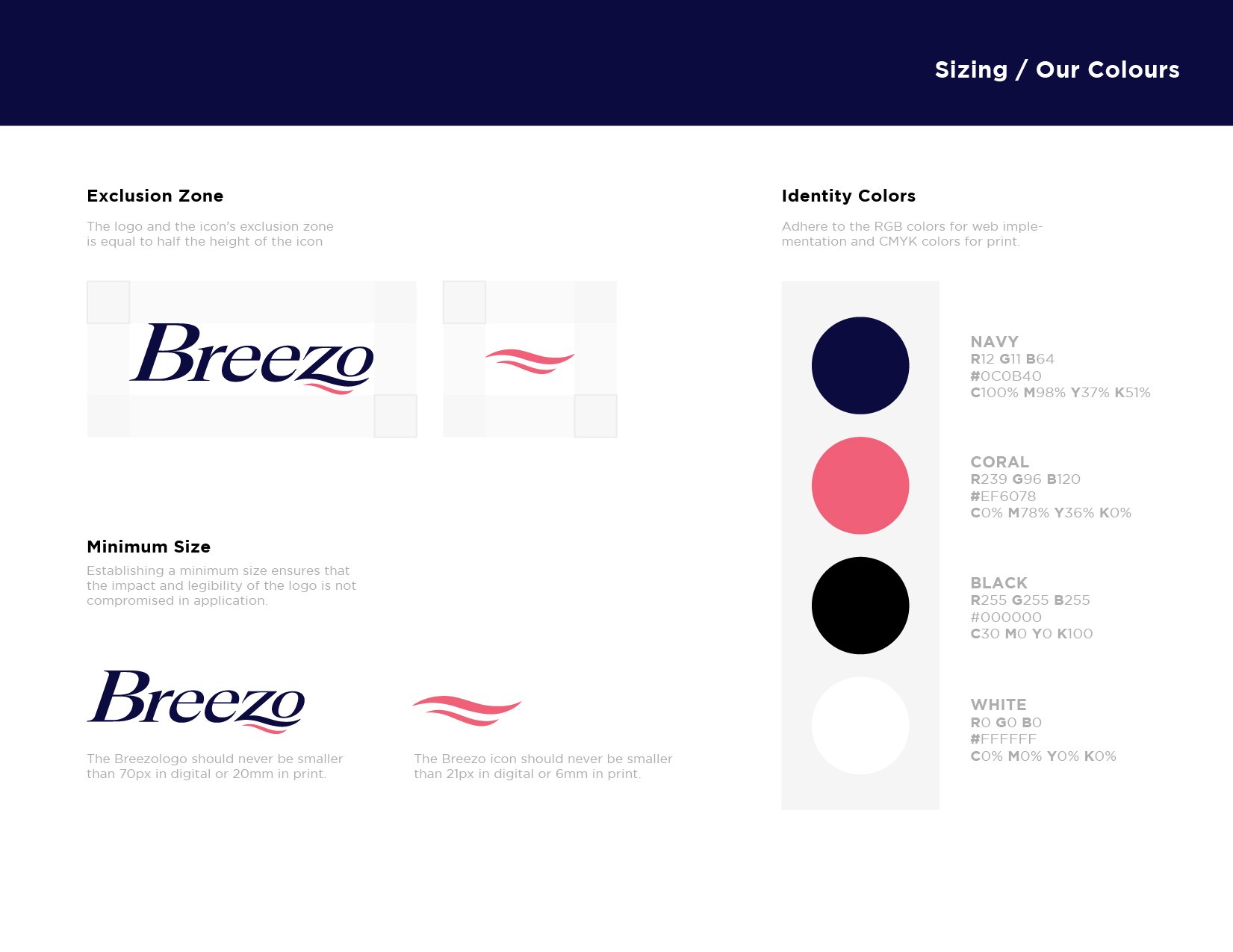
Oceanic palette: cool navy, off-white, and a hint of sky blue for freshness.
Typography & Color System
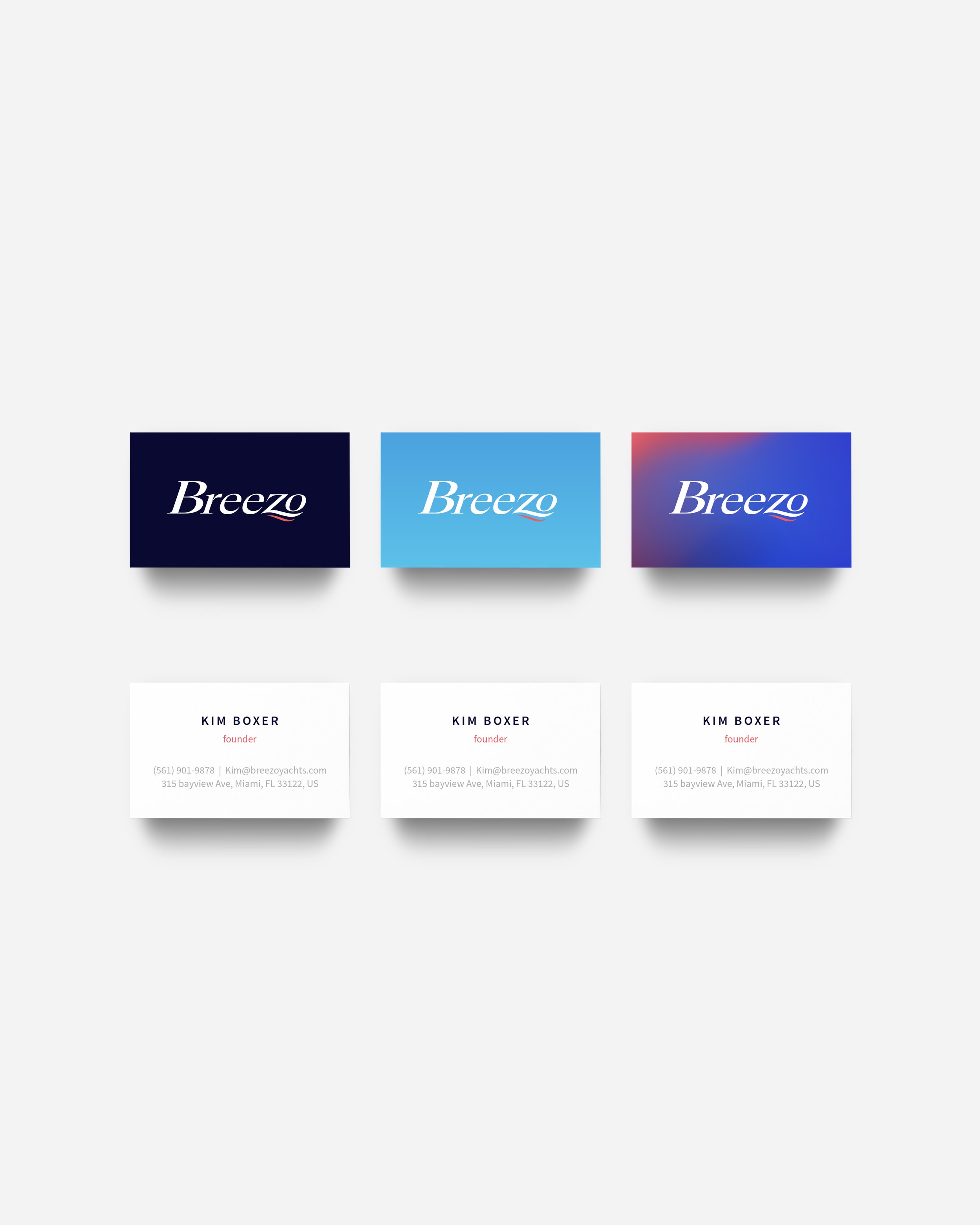
Mocked up packaging, social media frames, and boat-side decals.
Provided a flexible system with stacked and horizontal logo variations, visual rules, and mockups for investor pitch decks.
